Mastering Scatter Plots for Effective Data Visualization
Written on
Chapter 1: Introduction to Scatter Plots
As a Data Scientist, you are likely familiar with scatter plots. Although they appear straightforward, these plots are incredibly potent for visualizing data. By adjusting parameters such as color, size, shape, and regression analysis, scatter plots offer significant flexibility and representational strength. In this guide, you'll uncover nearly everything there is to know about using scatter plots for data visualization. We will explore various parameters and demonstrate their application through code, revealing useful tips and tricks to enhance your Data Science toolkit.
Regression Analysis
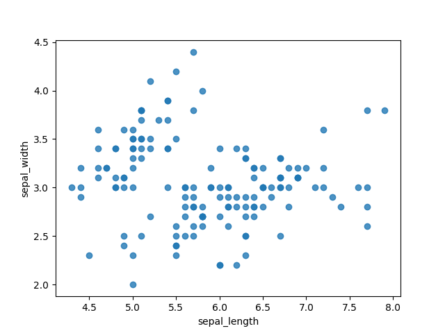
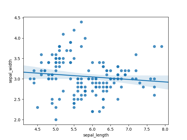
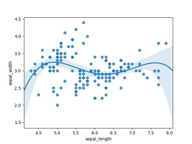
When we first visualize our data using a scatter plot, we gain an immediate understanding of its structure. The initial graphic below illustrates how data clusters together and highlights outliers. However, understanding the complexity of our data can be achieved through regression analysis. In the middle graphic, we observe a linear regression line; it quickly becomes apparent that this model does not fit well, as many points deviate significantly from the line. Conversely, the rightmost graphic employs a fourth-order polynomial, which appears to fit the data much more accurately, suggesting the need for a more complex model.
Section 1.1: Utilizing Color and Shape
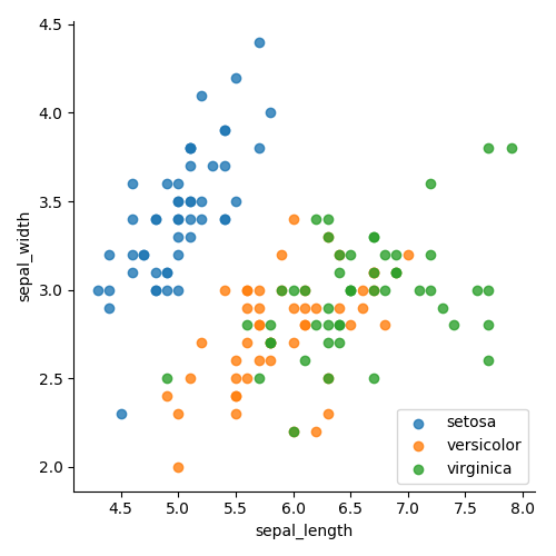
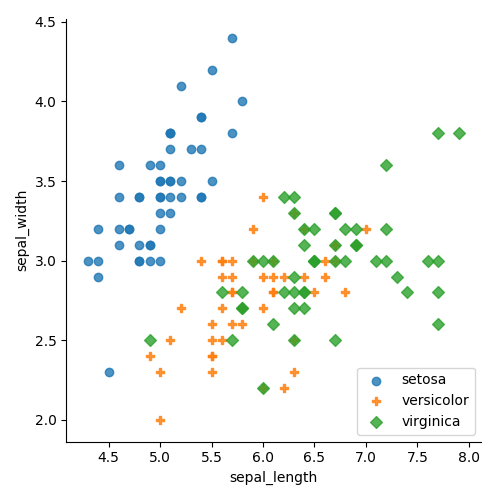
Colors and shapes can effectively represent different categories within your dataset. These visual elements align naturally with human perception, making it easier to discern groupings. For instance, in the left graphic, data points are categorized by color, while the right graphic uses both color and shape for differentiation. This clear distinction enhances our understanding of groupings, particularly indicating that separating the "setosa" class will likely yield low error rates. However, a simple linear plot may struggle to differentiate between the "green" and "orange" points, suggesting a need for a more advanced approach.
Section 1.2: Enhancing Visualization with Marginal Histograms
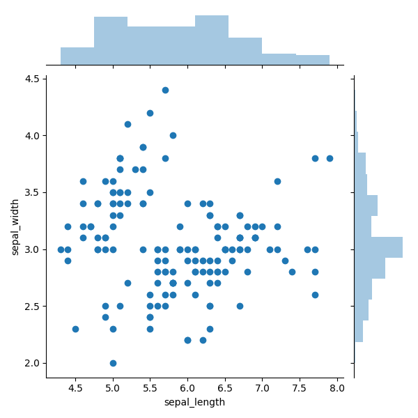
Scatter plots enhanced with marginal histograms include additional histograms atop and beside the main plot, displaying the distribution of data points along the x- and y- axes. This simple addition provides valuable insights into data distribution and helps identify outliers more effectively. For instance, in the graphic below, the y-axis shows a significant concentration of points around the value of 3.0, as evidenced by the histogram, which indicates that this value has three times as many points compared to other ranges.
Chapter 2: Exploring Bubble Plots
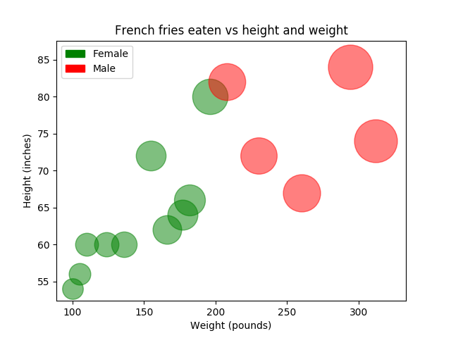
Incorporating bubble plots allows us to visualize multiple variables simultaneously by including size as an additional dimension. The graphic below illustrates individuals' consumption of french fries in relation to their height and weight. Even though scatter plots are inherently two-dimensional, we can represent three-dimensional data by using various attributes—position for height and weight, color for gender, and size for the quantity of fries consumed. This approach allows us to condense complex information into a straightforward 2D visualization.
Are You Ready to Learn More?
Stay updated on the latest in AI, technology, and science by following me on Twitter! Connect with me on LinkedIn as well!
This video, titled "Data Visualization Fundamentals - Using Scatter Plots," provides an overview of scatter plot fundamentals and their effective application in data visualization.
In this video titled "Statistics - Making a Scatter Plot," you will learn the step-by-step process of creating scatter plots and interpreting their results.