# Striking the Right Balance: Navigating User Feedback in Product Development
Written on
Chapter 1: Introduction to User Feedback Challenges
In the realm of product development, navigating user feedback can be tricky, especially for someone like me who isn't a user researcher or a product manager. My perspective stems from over ten years in various customer service and marketing roles within tech companies.
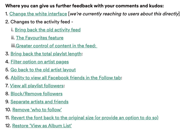
I began my career at Spotify, a medium-sized Swedish startup that was still establishing its presence. One of my initial tasks involved managing an online message board using a platform called Get Satisfaction. This forum had standard features like boards and threads, but it also included a unique "Ideas" board where users could vote on suggestions. This was an innovative way to gauge community interest.
At that time, I mistakenly believed that if companies paid attention to this board, they would be handed a blueprint for success. I thought of it as a prioritized list of features, a concept I now realize is far too simplistic.
Lesson 1: Understanding Your User Base
The primary error I made was not recognizing that those who engage with community forums are often not representative of the average user. These individuals, known as power users, are typically highly engaged and use the product in specialized ways.
For example, consider GiffGaff, the mobile network that thrives on community involvement, where power users can indeed influence decisions. Similarly, in the early days of Monzo, our user base comprised mainly fintech enthusiasts who provided invaluable feedback. However, the dynamics of this relationship have evolved over time.
Power users don't necessarily reflect the broader user base. For instance, in music streaming, some users enjoy curating their playlists meticulously, while others prefer simply hitting play. Catering to both types is challenging, if not impossible.
As noted in XKCD, any changes to a product can disrupt someone's unique usage patterns, regardless of how niche those patterns may be.

This brings me to a memorable instance at Spotify when we undertook a complete app overhaul. The transition was necessary due to outdated technology, but it involved removing some existing features temporarily.
The backlash from the community was intense, leading to a lengthy thread titled "HORRIBLE UPDATE (0.8.8)," where users felt we had fundamentally altered the app for the worse.

Despite the uproar, the changes ultimately enhanced the app's performance and user experience. Most users appreciated the improvements, even if they didn't express it on forums.
Critics often argued that we couldn't possibly know the app's reception without user feedback. While it's true that not everyone shares their satisfaction, Spotify's extensive data analytics offered insights that forum threads alone could not provide. The lesson here is to balance listening to power users while recognizing that their perspectives may not reflect the general user experience.
Lesson 2: The Dilemma of Competing Use Cases
The ideal Spotify interface would be a simple play button that selects the perfect song for any moment. However, music enthusiasts demand more detailed controls, such as equalizers and nested folders.
If we were to follow my earlier belief in the "laundry list" approach, the result might be an overly complex app.

This complexity creates barriers for new users, making the product less accessible. The notion of simply adding options for customization often leads to an unwieldy user interface.
To illustrate, I often refer to "The Homer Car," a concept from The Simpsons where Homer designs a disastrous car that ultimately leads to his brother's bankruptcy. This epitomizes the pitfalls of catering to every user request without a cohesive design strategy.

Adding toggles for every feature leads to multiple app permutations, complicating future updates and bug fixes. Maintaining a simple, unified user experience is crucial to effective product development.
Lesson 3: The Power of Minimal User Research
User research, though often overlooked, is vital for understanding user needs. While my earlier experience with the Ideas board seemed beneficial, genuine insights come from structured research.
It's essential to differentiate between what users say they want and the underlying needs driving those desires. For instance, many may express a desire for a credit card, but the underlying need could be access to financial resources.
Research indicates that speaking to just five users can yield significant insights. It may sound counterintuitive, but if multiple users encounter the same challenges, that signals a broader issue.

While five users may seem insufficient, their feedback can guide product decisions, especially when combined with insights from a diverse user base. It’s about finding a balance between vocal power users and the broader audience that will drive future growth.
Lesson 4: Aligning Product Development with Business Goals
Every department within a company should align with overarching business objectives. For tech companies, this often means focusing on growth and revenue.
User feedback doesn't always correlate with these goals. For instance, while users might demand an edit button on Twitter, such features may not necessarily attract new users or increase revenue.
User perceptions often don’t align with the complexities of business operations. For example, Spotify frequently received requests to add The Beatles' music, but licensing such tracks is a complicated, time-consuming process.
Thus, there exists a gap between user desires and strategic product development. A popular request, such as custom categories in Monzo, may not be a priority if it mainly serves power users rather than the broader market.
Prioritizing features that align with business goals ensures that resources are allocated effectively, allowing for the development of features that benefit the majority.
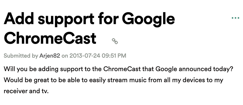
This brings me to a personal experience at Spotify regarding the much-requested Chromecast support. While it seemed like an easy win, the technical challenges involved meant it was not prioritized for a long time.

When it finally launched, it wasn't the game-changer many users had anticipated. Most users just wanted a seamless listening experience without the added complexities.

In conclusion, these reflections stem from years of experience grappling with the intersection of user feedback and product development. I hope these insights resonate with others navigating similar challenges. Your thoughts and feedback are welcome!
A complete tutorial and review of the ZWO AM5 mount, exploring its features and user experience.
An in-depth review of Nielsen Tyre Dressing, examining its application and performance.